Get Personal: Designing in the Hyphen
Designing a new magazine to share the stories of hyphenated Canadians
By Josh Layton | April 17, 2019
In and out of the studio, the Loop team are always finding ways to get our hands dirty and jump into new creative challenges. Personal projects are an important part of our culture because they allow us to explore new design styles and approaches and dive into new topics that we’re passionate about.
Over the next few months, we’re excited to Get Personal with the Loop team and share some of the exciting design challenges that we’re tackling after 5 p.m.
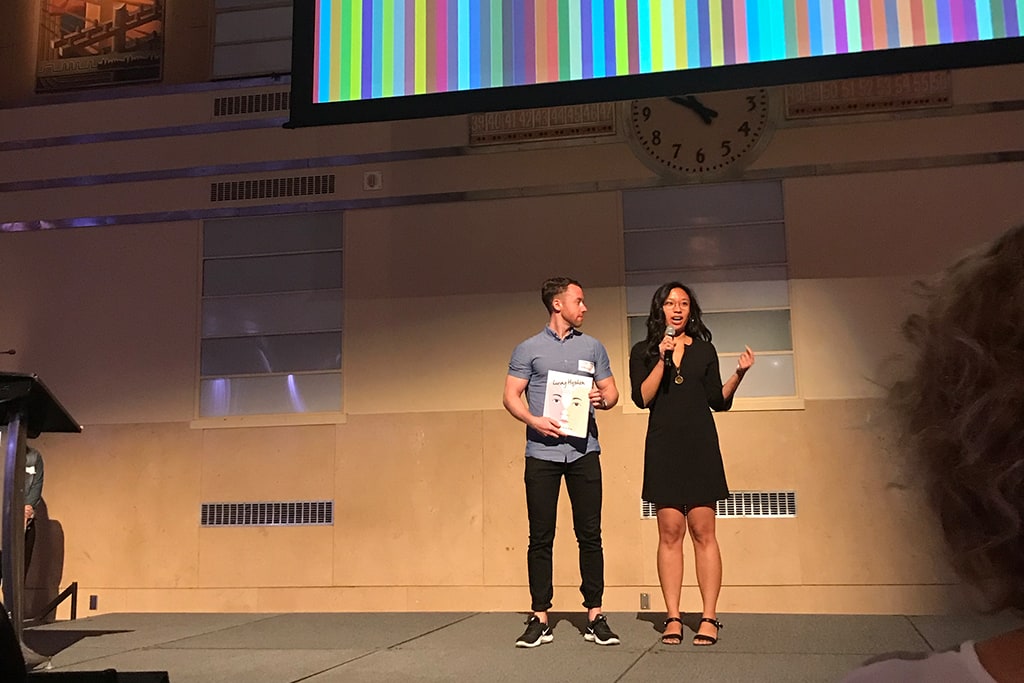
In the first edition of Get Personal, we’re speaking with our Creative Director, Josh Layton about the launch of a new magazine he’s been working on called Living Hyphen. This new magazine is all in the family at Loop, having been founded by one of our close collaborators and clients, Justine Abigail Yu.
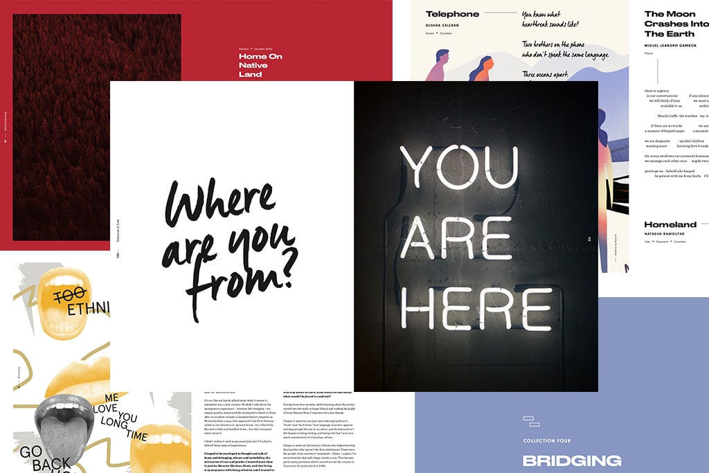
Living Hyphen is a print publication that explores the experiences of Hyphenated Canadians — those who call Canada home but who have roots in different and often faraway places. Brought to life by contributing artists and writers from all across Canada and hailing from over thirty ethnic backgrounds, religions, and Indigenous nations combined, the first issue explores the theme of “Entrances & Exits” to reveal the many figurative doorways that have shaped their identities.
How did you get Involved with Living Hyphen?
Having worked with our friend Justine for years on numerous projects, when she proposed the idea for Living Hyphen I knew she was onto something important. As Canadians, especially white Canadians, we often pride ourselves on the value of “strength in diversity,” however we rarely explore what that actually means. I was eager to learn more about how living between cultural identities has impacted the people I call friends and family and be part of a movement to share these often marginalized stories with the world.
This was one of those unique opportunities to build empathy and connection around what it means to be Canadian.
What inspired the design direction for the magazine?
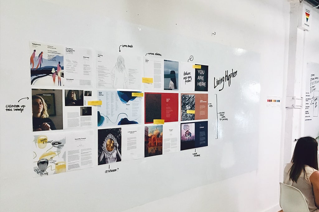
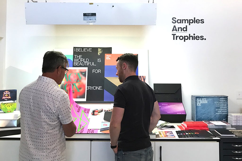
From the get-go, we knew that the design of the magazine needed to make people stop and awaken their curiosity. The world of print publications is a tough one to break into, and we needed to design a piece that would exude quality in a way that people would be proud to display on everything from their Instagram account to their coffee tables at home.
Every design decision was made to highlight the sheer impact of the contributed content, including personal stories and quality artwork that was curated from artists across the country. Every detail was carefully selected to frame personal experience, and bring these stories to life in a way that respects the many cultures, diversities and nations of Canada. Even the size and stock choices were selected to feel tangible, using a variety of textures and weights that speak to the importance of the conversations that the magazine can spark.
Layouts were thoughtfully arranged to enable the reader to explore the many facets of diversity in Canada, including colour, subtle patterns, and typography.
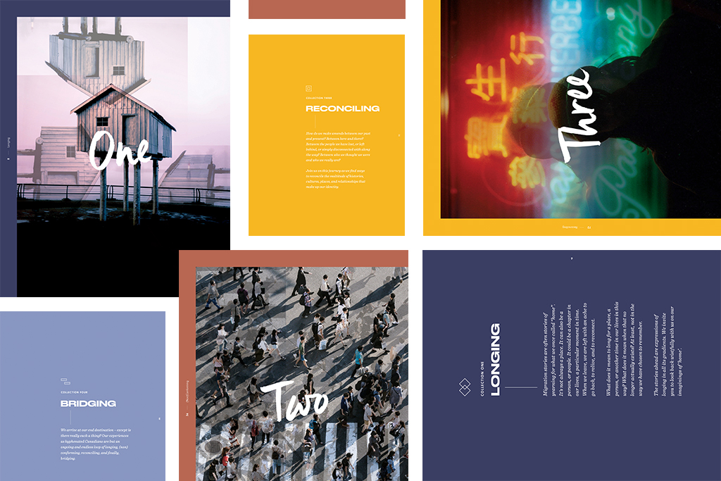
Colour is a defining element of the piece, helping to communicate the importance of our four chapter themes – Longing, Non-conforming, Reconciling, Bridging. Each theme is represented by a unique colour that introduces and flows through the chapter, ensuring each element of the hyphenated experience has a unique identity of its own while helping readers navigate the many facets of the magazine. A selection of custom hyphen icons also showcases each contributor’s unique hyphen (i.e. Fillipino-Canadian). Using these small design touches add a special sense of attention to each contributors experience, and highlight the sheer diversity represented within the magazine.
Typography was also selected to bring a human voice to the magazine. The many pieces are accentuated by a modern script font which brings a human element into the piece, calling attention to small phrases common to the hyphenated experience such as a mother saying, “I love you,” but being lost in translation or the phrase “….but where are you really from?” These expressions of the hyphenated experience are common among many of the pieces curated for the magazine and help unite each story with universal design language.
Full-colour spreads, such as the story “Home On Native Land,” punctuate the magazine and bring attention to powerful pieces that really force the reader to stop, read, reflect and challenge the realities of our diverse country.
How has Living Hyphen impacted you as a designer?
Designing a magazine around the experiences of hyphenated Canadians has been a humbling experience. Each piece has deep personal meaning and demands respect. As core representations of the Canadian identity, these stories deserve to be heard, and working with them has opened my eyes and creative approach.
Having had the opportunity to work closely with Justine, artists from across the country, printers and other partners has felt truly intentional and collaborative adding to the joy of this project.
Get your hands on Issue 1: Entrances & Exits here
122 pages, perfect bound and printed in full colour on FSC-approved paper in Toronto, Canada.