Inspiration Roundup: Design for Social Good
Summer 2019
By Emma Steele | July 16, 2019
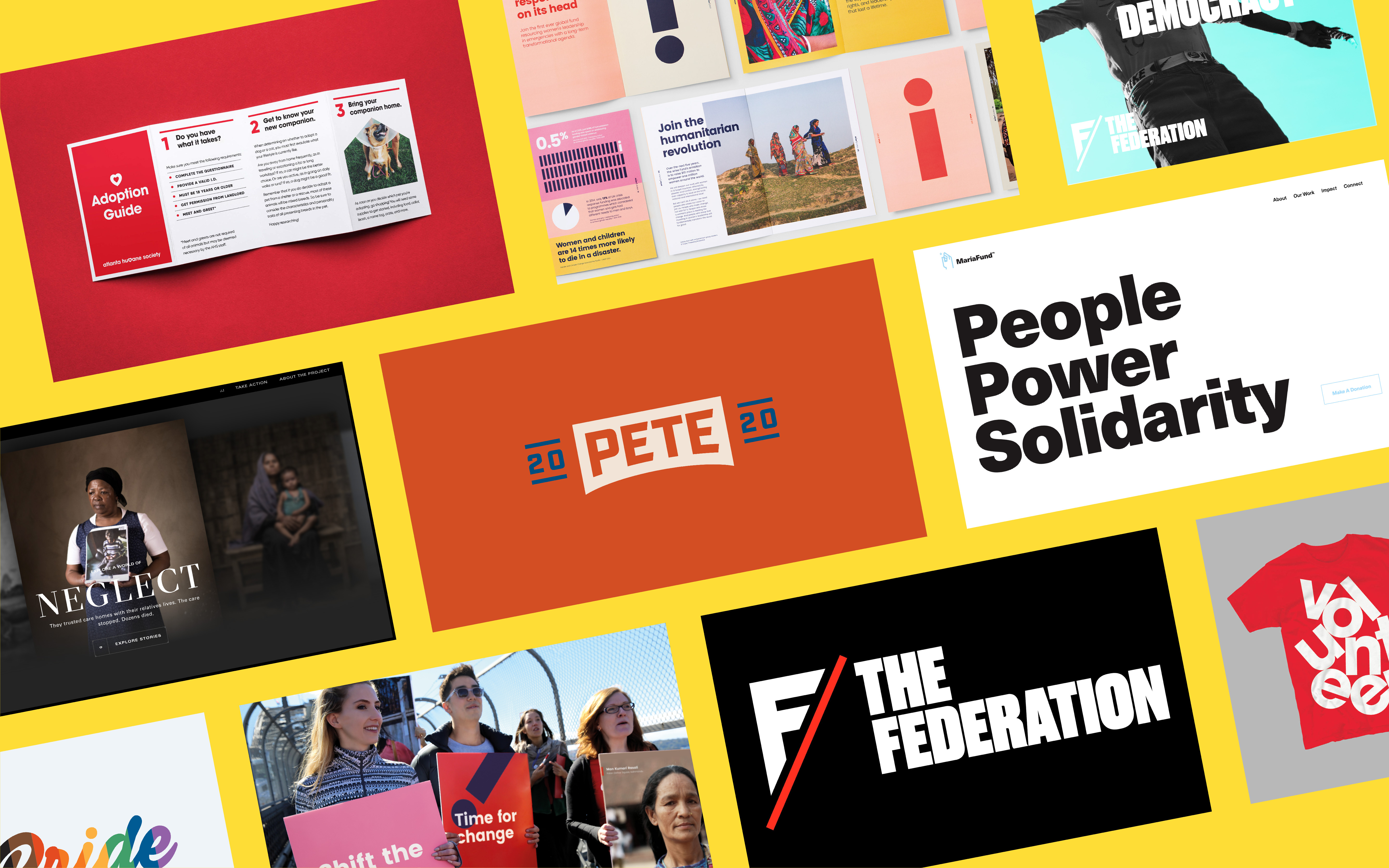
Here at Loop, we know that great design isn’t created in a vacuum. It’s the reason we love design for social good so much — the more innovative and complex the cause, the more compelling the design! But design is not created in a visual vacuum either. To get inspired and inspire our clients, we are constantly looking for visual inspiration that stimulates our imagination and helps us to envision what’s possible for upcoming projects. Visual research is a key part of our process, and we always have our eyes peeled for beautiful new websites, campaigns and brands to add to our inspiration arsenal.
While it can be easy to get competitive in the creative world, we are all about putting out good, supportive vibes when it comes to design for social good, because you can just never have too much! We LOVE that there are other agencies like us who focus on design to change the world. So here is a quick summer roundup of the social impact designs that we’ve had major heart eyes for recently.
1. We The Federation
By Pentagram
I mean, it goes without saying that Pentagram is one of the greats when it comes to design agencies. They are responsible for some of the most recognizable design for many of the boldest initiatives of that last few decades. But we definitely appreciate when they take on work for social impact organizations in addition to their more corporate clients. Last spring, the New York Pentagram team completed the brand identity, website and messaging for The Federation – an art action group formed to keep cultural borders open and fight defunding of the arts. The organization was initially founded in response to the Trump travel ban, and they are now devoted to showcasing the power of art in activism and democracy.
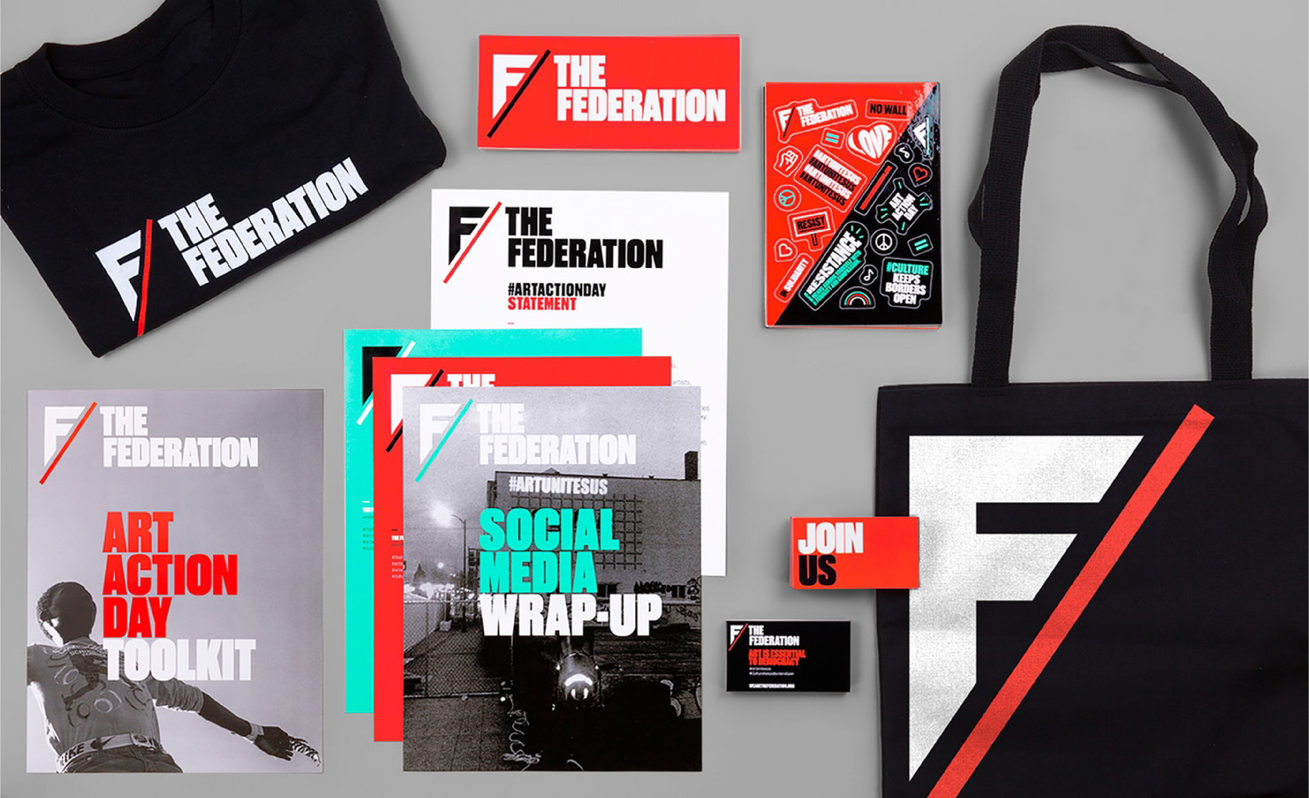
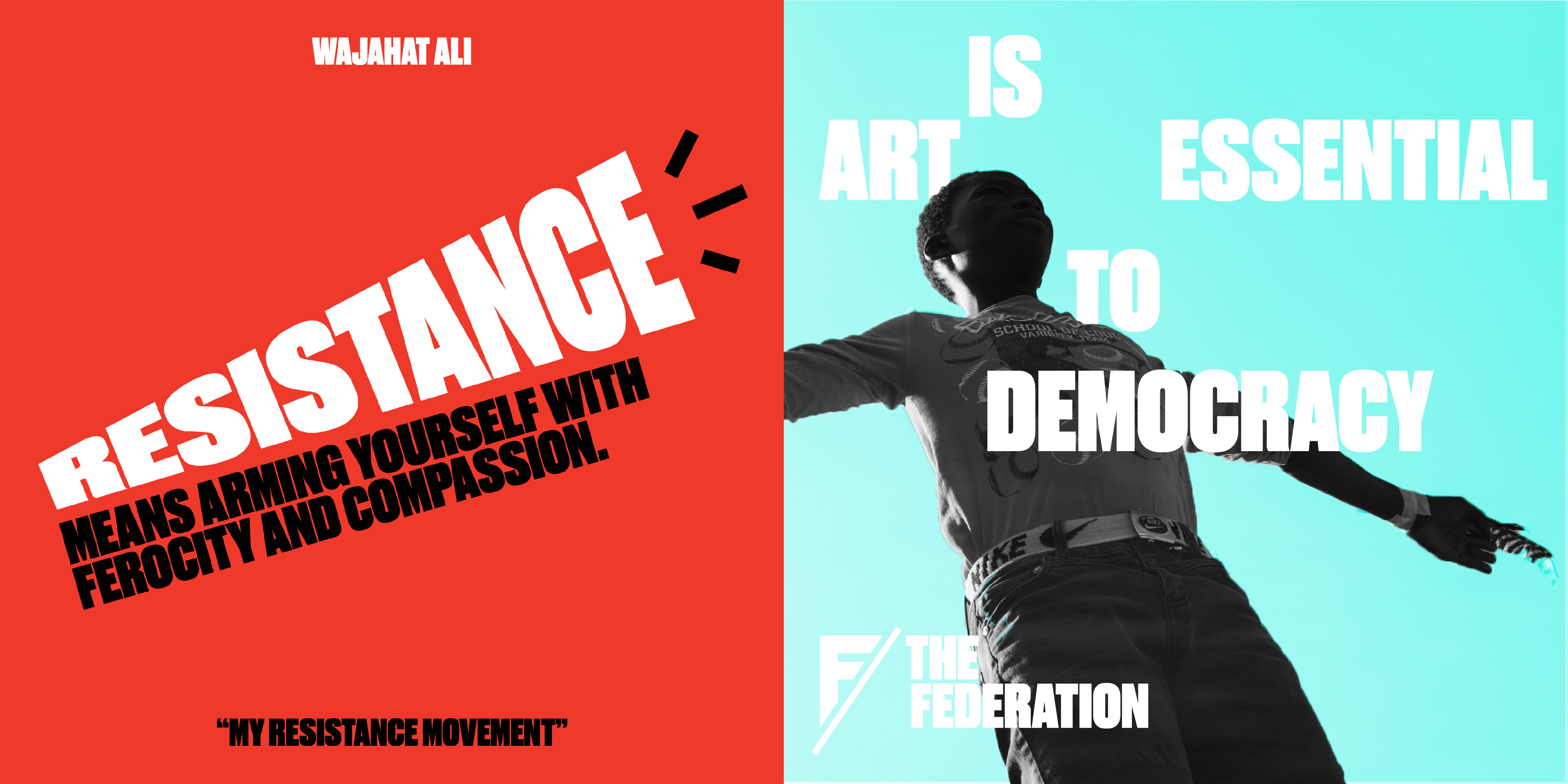
We love the urgency and strength of this brand. The mark is smart, striking and distinct, and looks great alongside other protest-related graphics. The colour palette – a vibrant red and turquoise with classic black and white – is daring & loud, and helps imbue the brand with energy & power. This power is only amplified by the chunky, bold typeface shown exclusively in all caps – the surest way to “shout” your message at your audience. These elements work seamlessly across all types of digital and printed collateral, which is so important for groups looking to rise up and create a global movement. The use of elements in different combinations and at different scales makes for an instantly recognizable aesthetic that can be used over and over without getting stale.
2. Pete for America
By Hyperakt
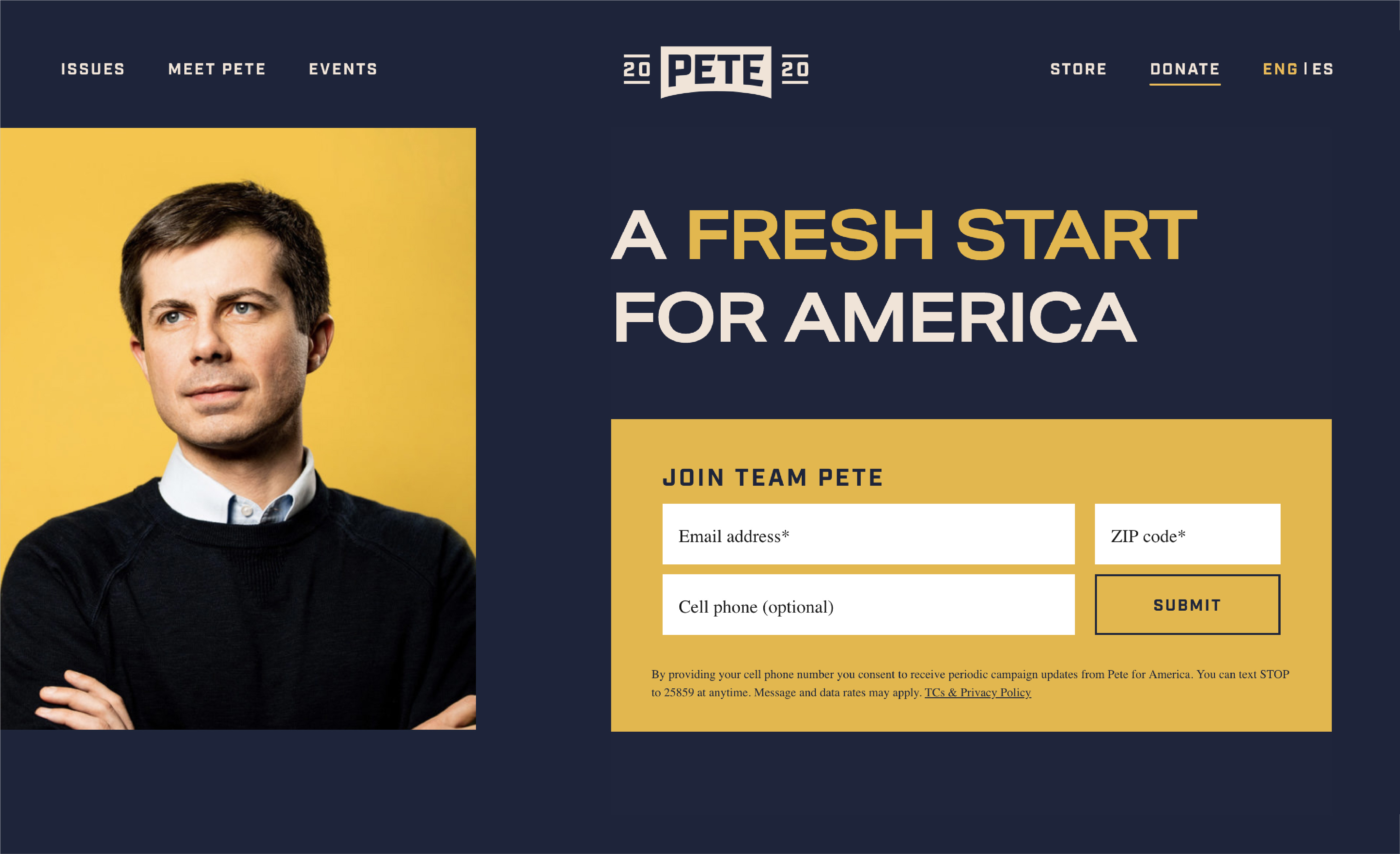
The American Democratic Primaries are heating up, and we know there are some stand out candidates, but can we just take a moment for some stand-out campaign design props? The Loop team loves Indiana Mayor & Democratic Candidate Pete Buttigieg’s campaign merch so much, that we’re ordering some for our (Canadian) office! This smart and subtle brand identity was designed by the amazing Hyperakt, a human-centered, storytelling-focused design agency in Brooklyn, New York.
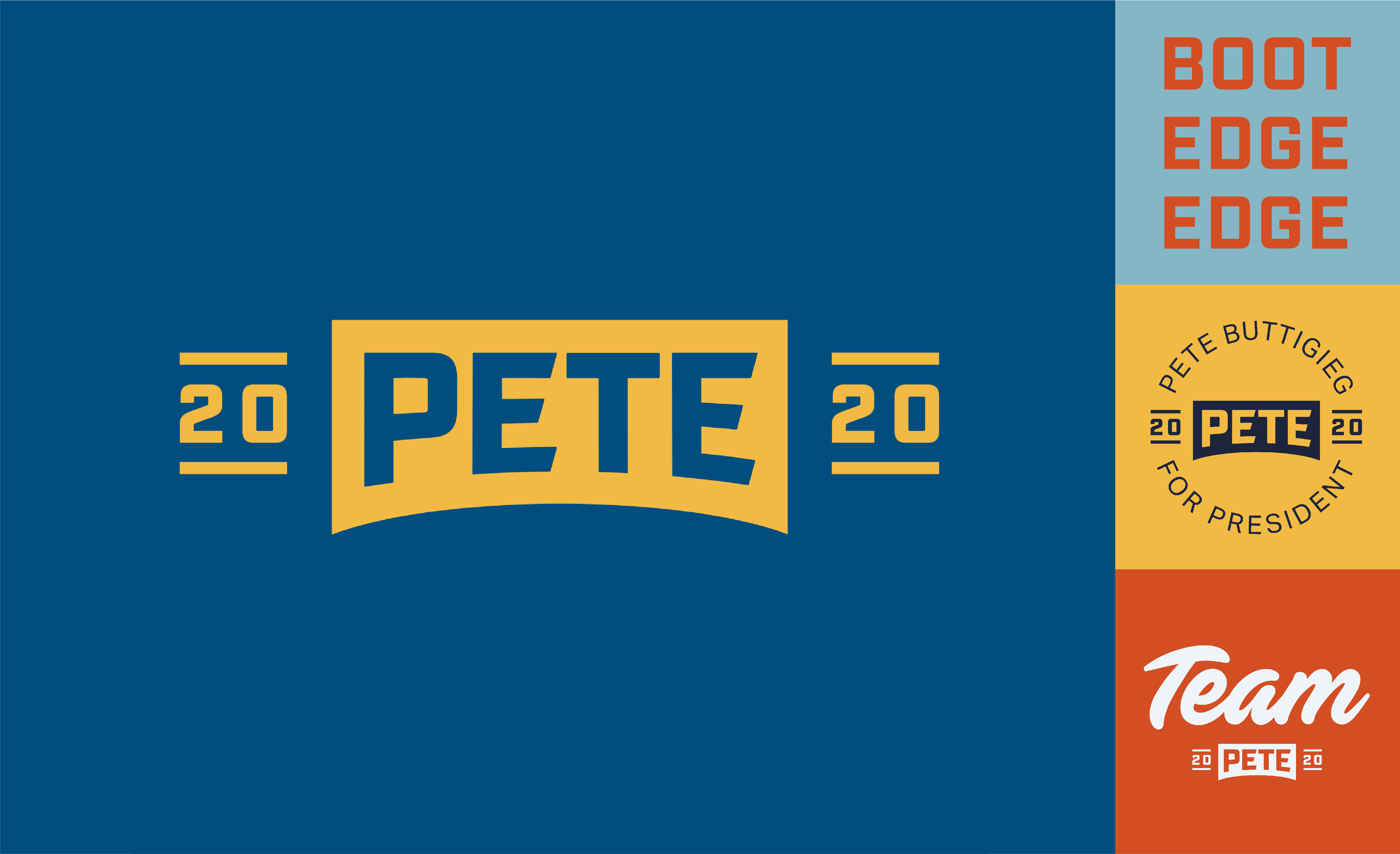
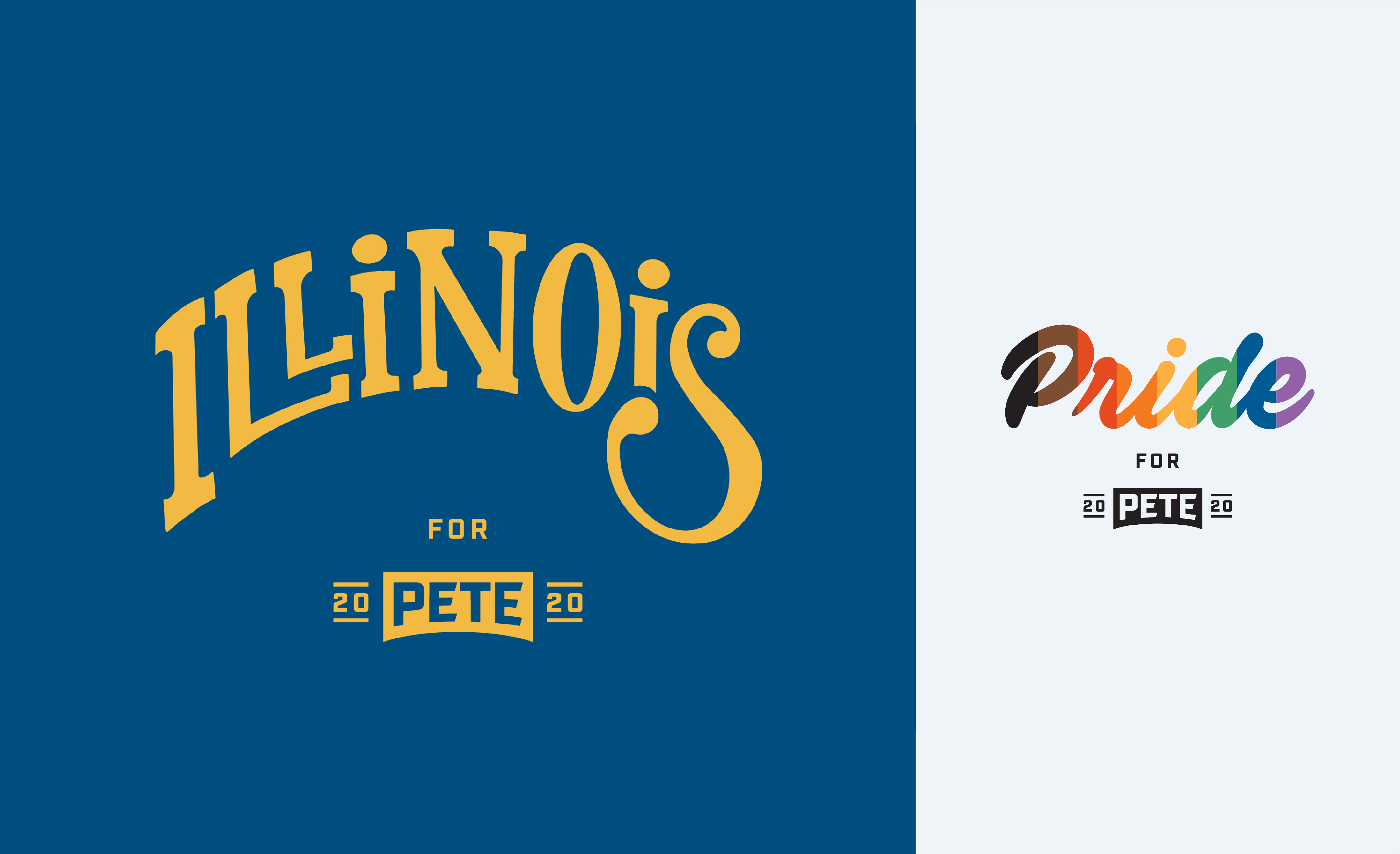
What we love most about the Pete for America brand is its distinctiveness and its versatility. By avoiding the traditional red, white & blue palette so entrenched in North American political campaigns, the Buttigieg collateral has an identity and personality all its own. It features an earthier palette with pops of unexpected colour that works across a system of brand marks. These marks range in composition and content – one says “Team Pete 2020,” another simply says “BOOT EDGE EDGE” – and this brilliantly allows for the identity to speak to a wide audience with varying needs. By allowing them to choose and download different marks in different colour combinations, people are far more likely to use their “custom” Buttigieg graphics to host parties, attend events, and spread the word – exactly what a grassroots political campaign is supposed to do.
Oh, and the Buttigieg brand extensions are just as good as the identity. Don’t get us started on the Pride logos! And we still can’t get over the custom lettering downloads for different American cities.
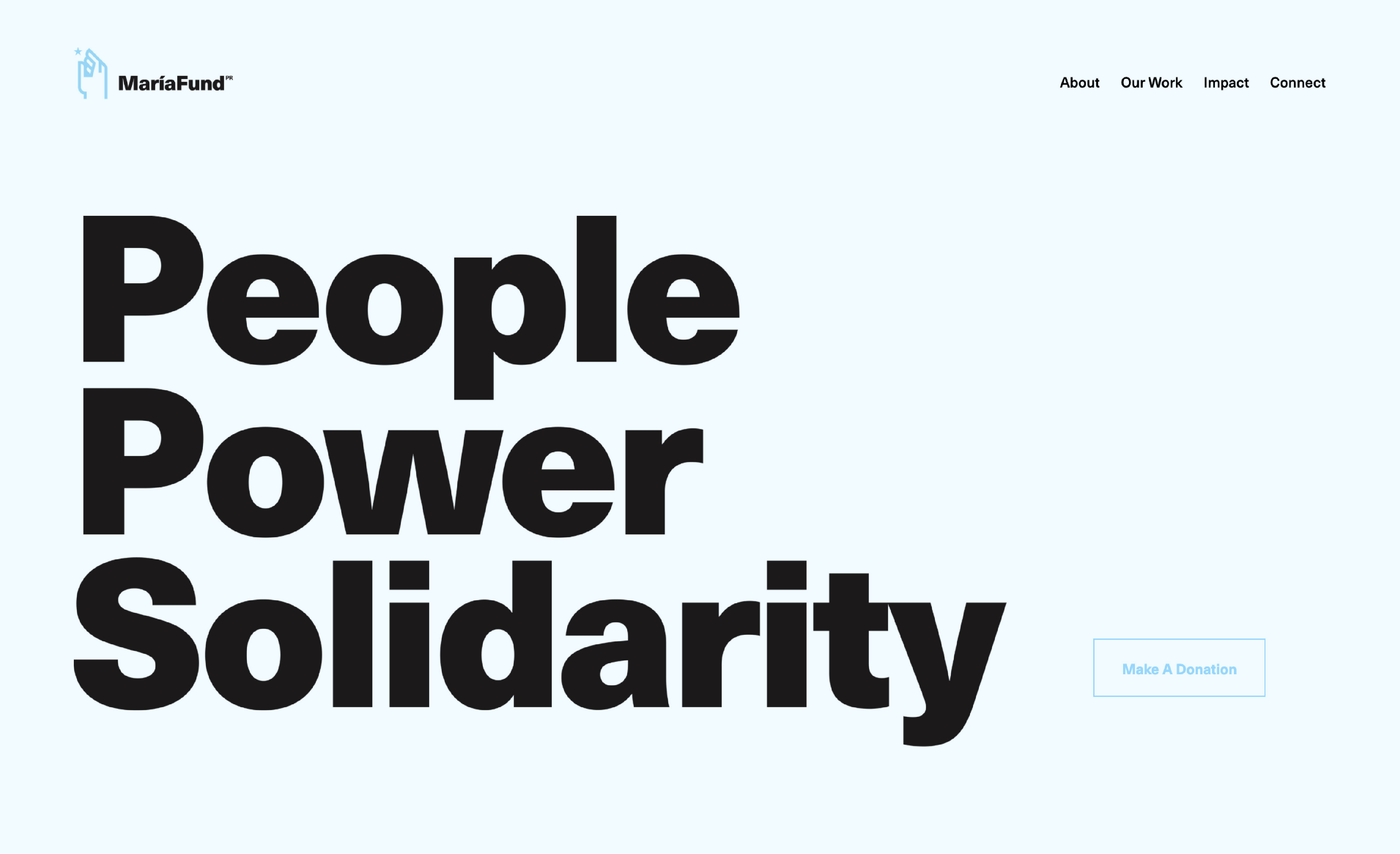
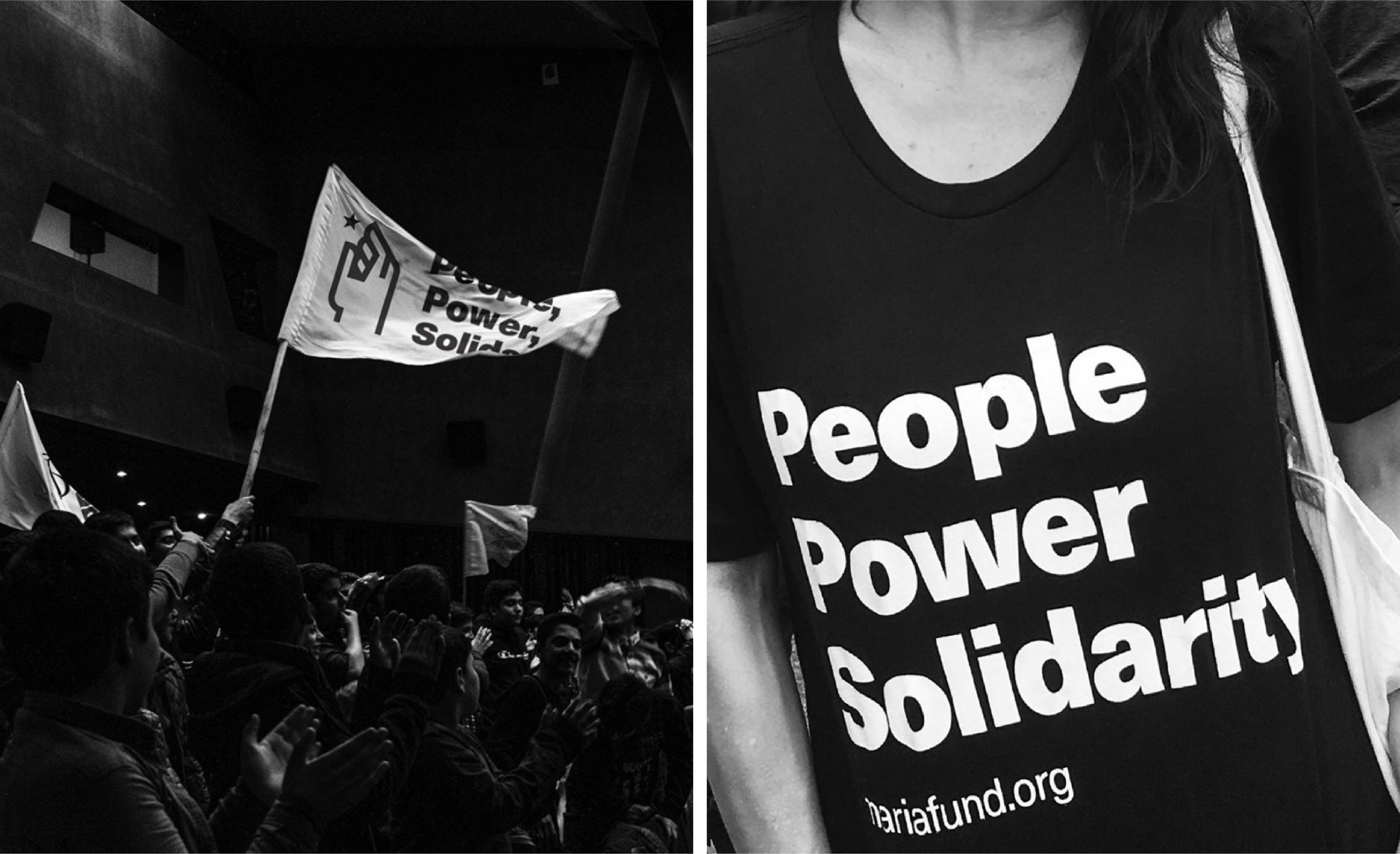
Revealed in June of this year, the new identity for The María Fund – designed by Puerto Rican agency División de Diseño – makes a fresh but powerful statement. Initially set-up to support frontline & grassroots efforts dealing with the aftermath of Hurricane María in Puerto Rico, The María Fund continues to support economic, political & environmental work in the country.
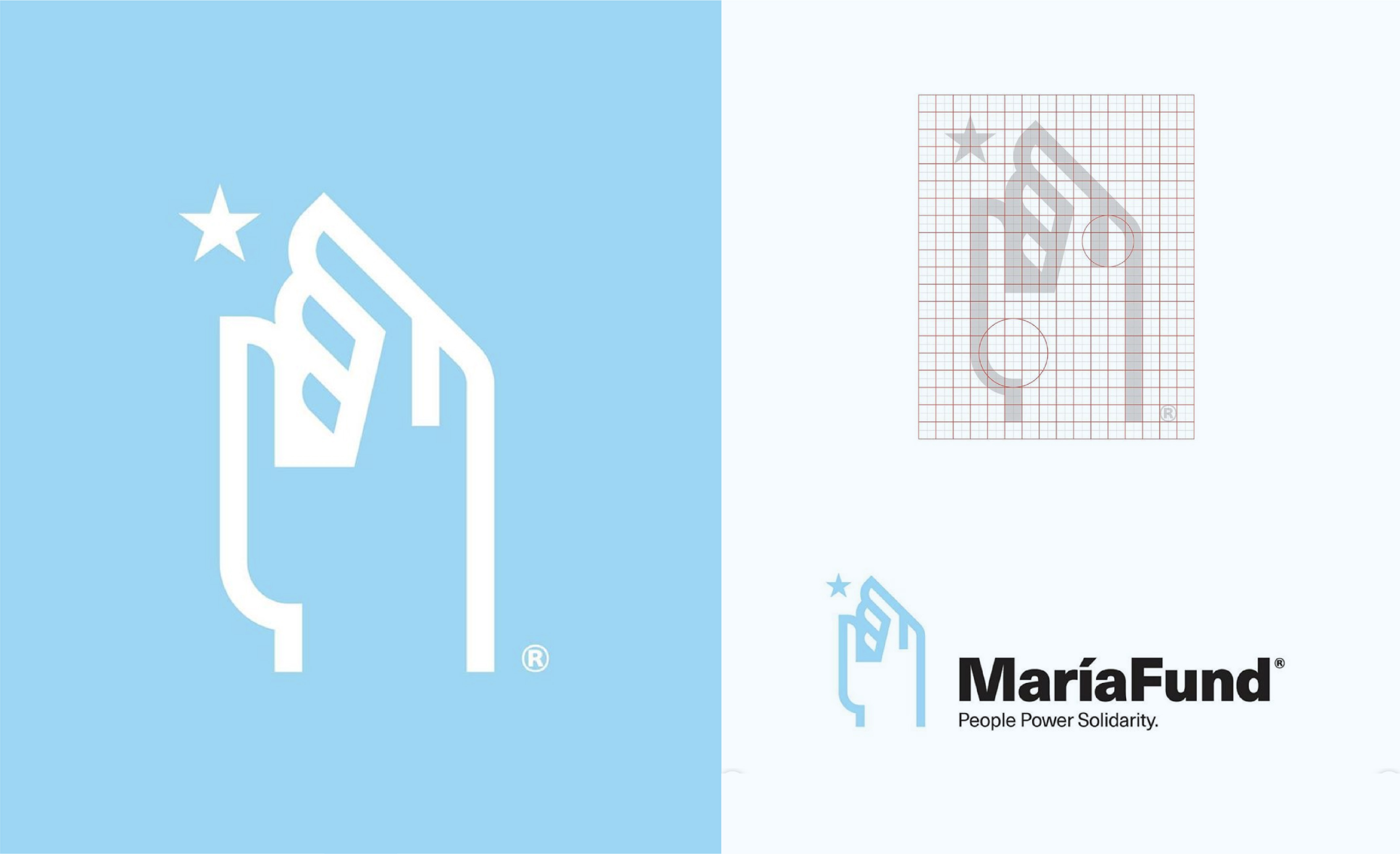
The bold simplicity of this brand mark works as both a symbol of humanitarianism and activism. The mark’s meaning and message is clear, and there is a subtle nod to the Puerto Rican flag. The colour and type for this identity are simple but impactful – the light blue (an unexpected choice for disaster relief) gives the brand an optimism and vulnerability next to bold, black typography. This combination of quiet colour and powerful type helps capture the brand’s mission – again speaking to both humanitarianism and activism – and highlighting to the urgency of The María Fund’s mission.
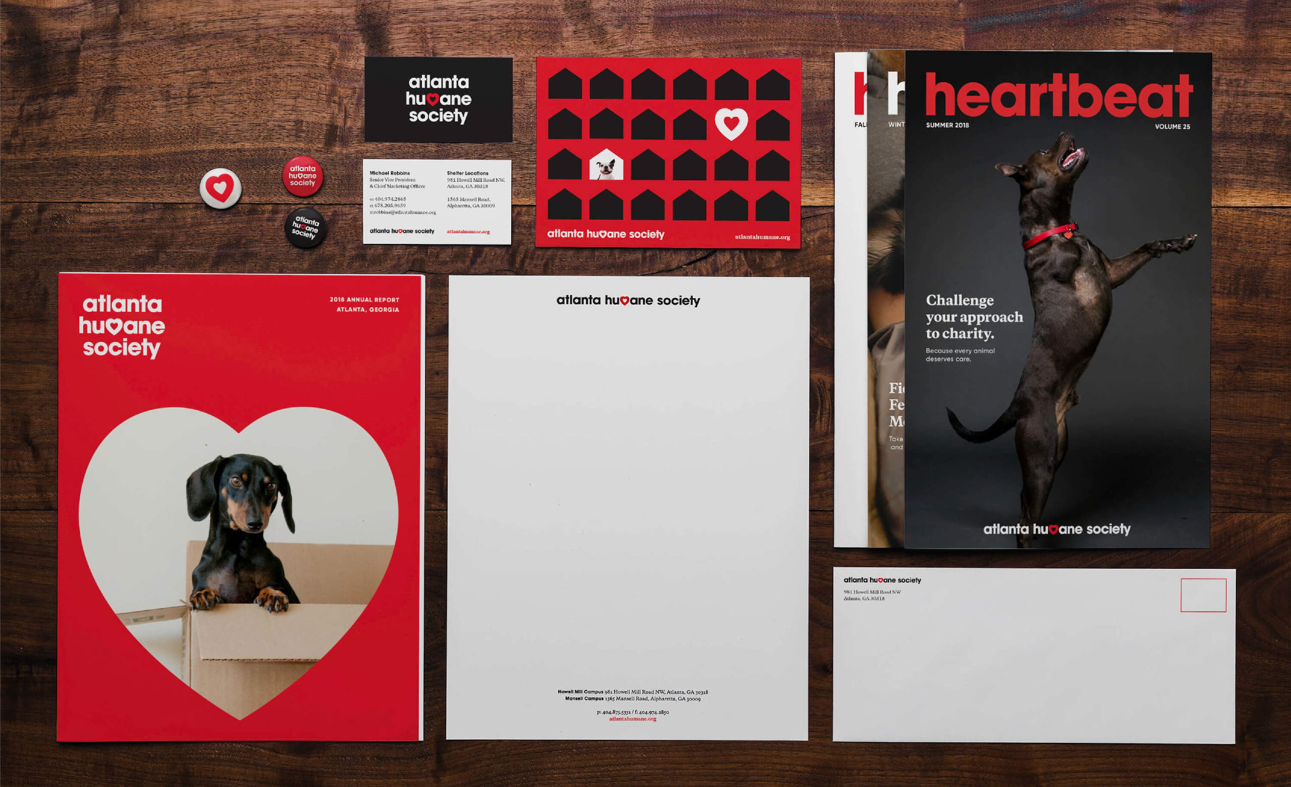
Who says meaningful, impactful design can’t also be adorable? The Atlanta Humane Society recently got an oh-so-cute brand refresh courtesy of Matchstic in Atlanta, GA, that refined their logo, rethought their brand applications and reimagined their brand voice.
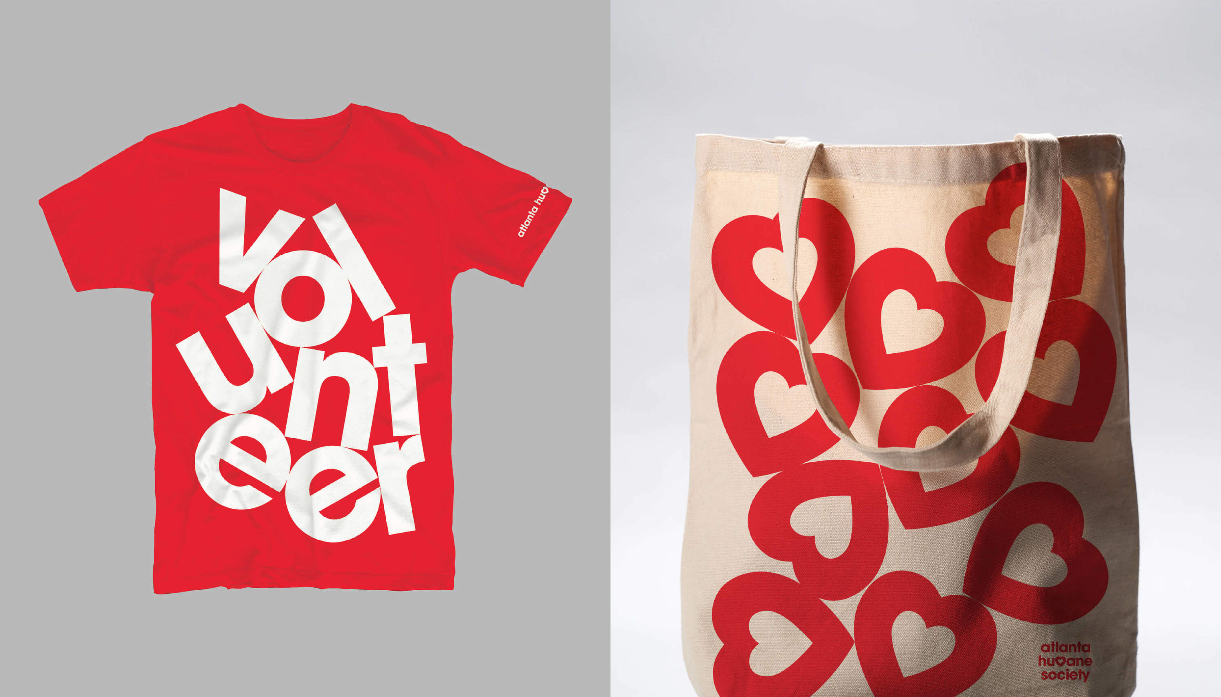
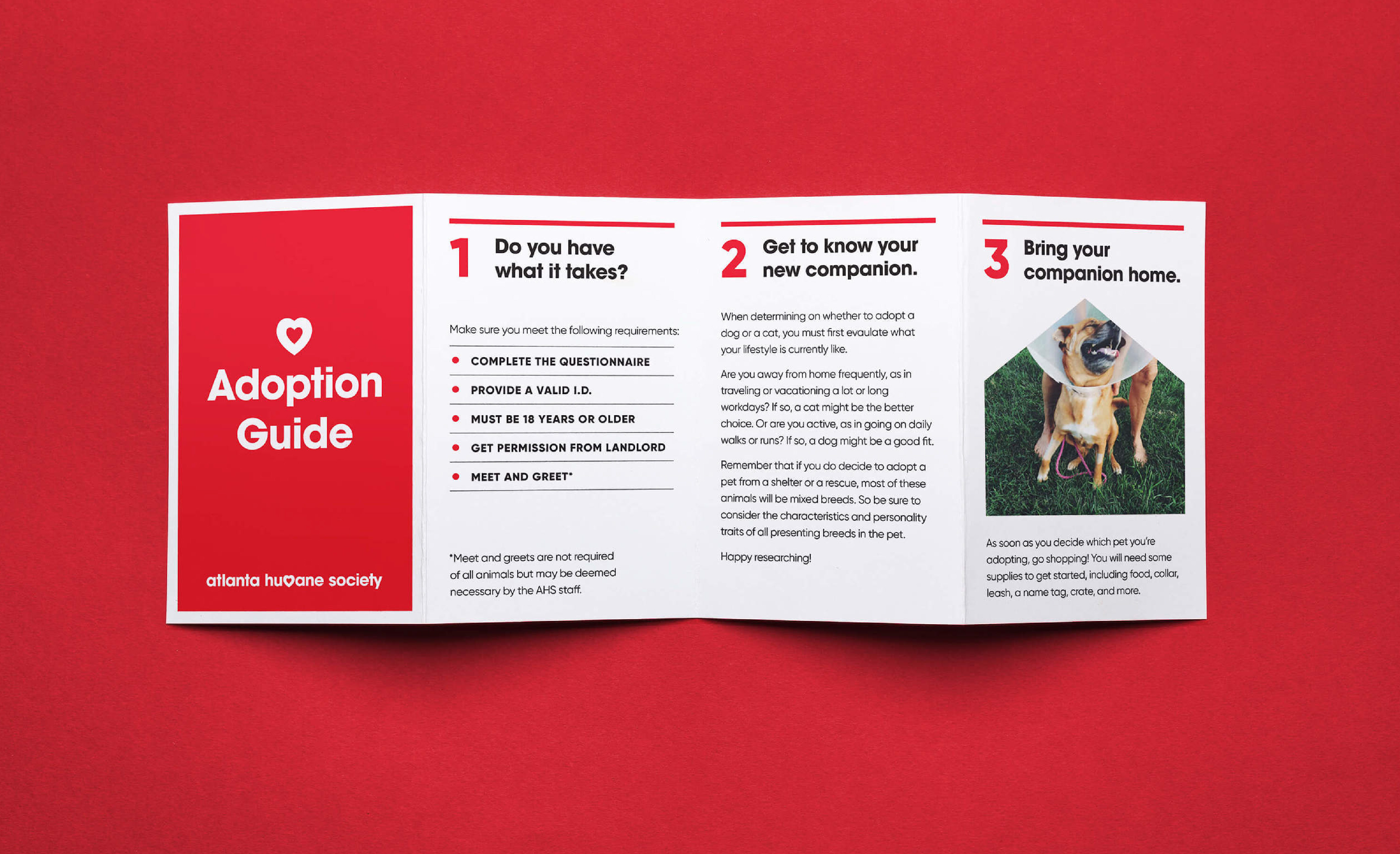
While the brand’s logo evolution is very linear, the way the new brand has been applied is fresh & simple and brings empathy and purpose to the forefront of collateral. Friendly lower-case type, large simple shapes, and bold pops of red complement and highlight the photography that’s so essential to the cause. We also appreciate the applications that feature crooked & stacked typography – this treatment gives the brand some whimsy and joy, but the application hasn’t been over-used. The brand’s elements work in almost any combination – repeated patterns, enlarged shapes, image masks – and this makes for a versatile identity that will serve the Atlanta Humane Society well going forward.
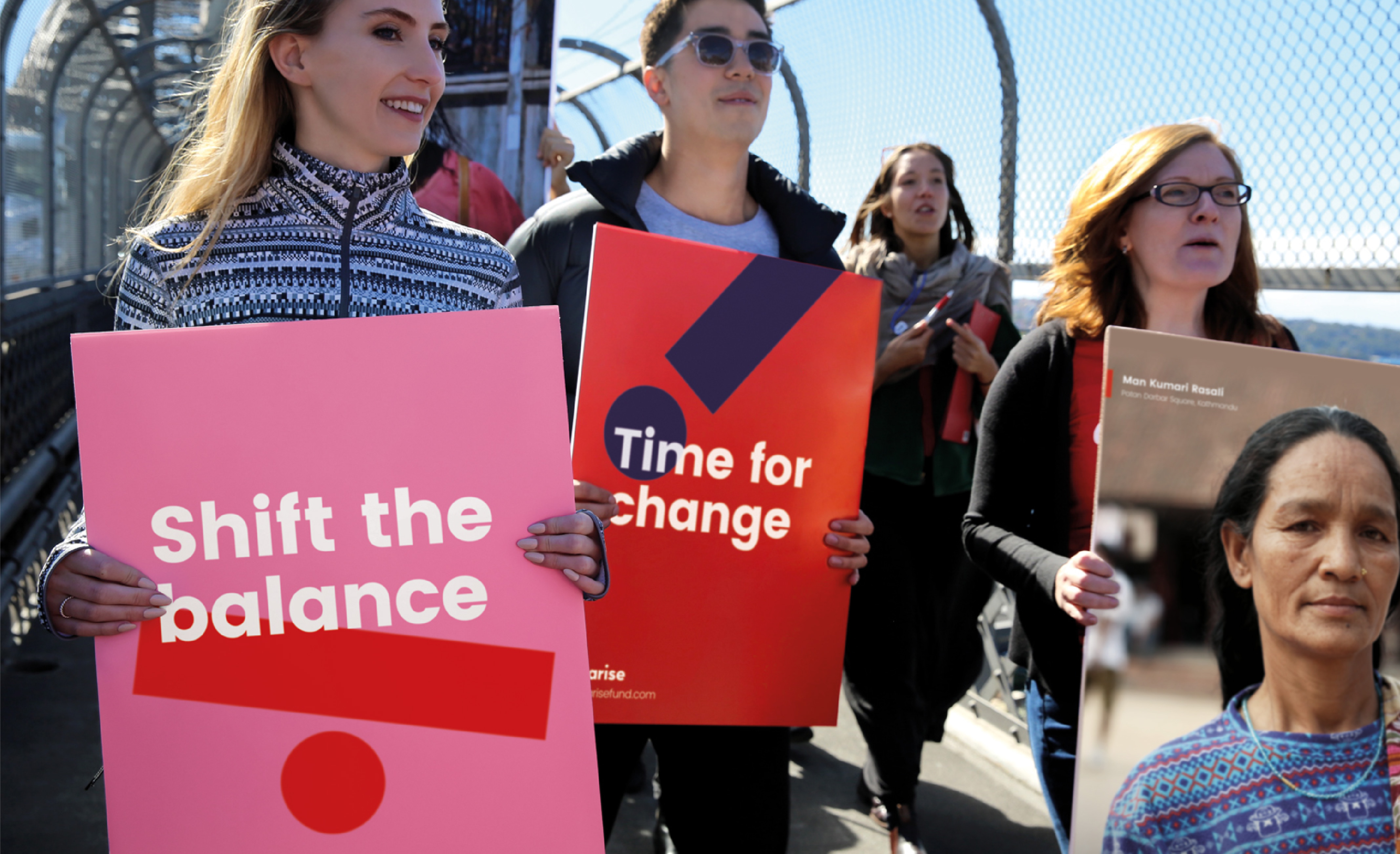
As an agency that works with many women-centred organizations, the Loop team was so inspired by the Arise campaign created by the international firm Re Agency for ActionAid. While women & children are disproportionately affected by crises and disasters, they are rarely seen in leadership roles when it comes to crisis management and disaster relief. With this knowledge, ActionAid set out to launch the first global fund directly supporting women-led emergency preparedness and response.

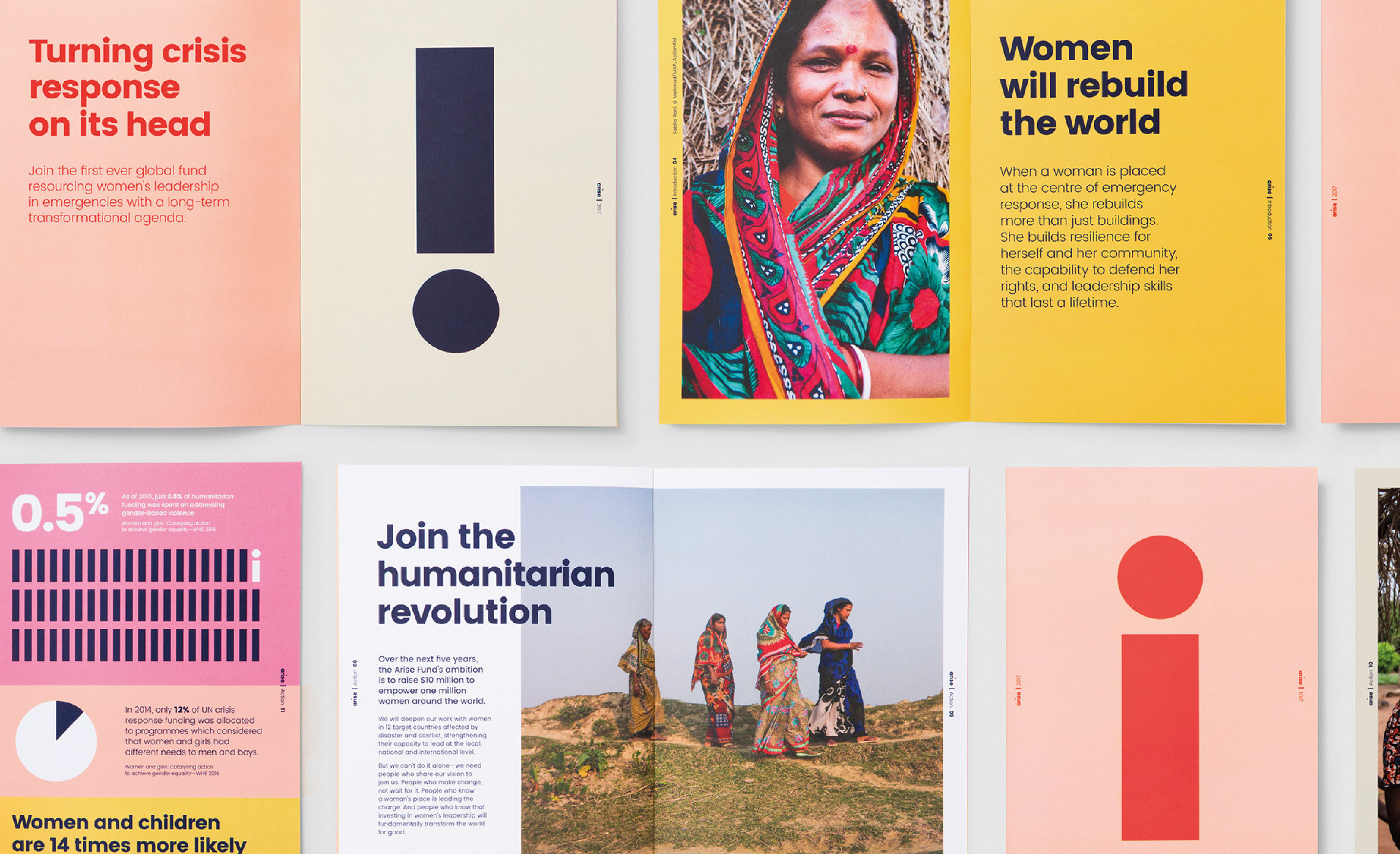
The notion of turning crisis management “upside down” by positioning women at the helm is brilliantly captured by the brand mark, which features motion as a key part of the design. While the animated mark is a major piece of the identity, the brand symbol “i” is just as effective as a static element on printed collateral, especially when it’s shown in the campaign’s unique colour palette. We love the inventive way that the “i” element is broken up and carried through the campaign collateral and the innovative use of motion through the applications. The animation is subtle & smooth and helps give the digital parts of the campaign energy. The motion is also mirrored on printed pieces by positioning the brand symbol in pieces at odd angles. This campaign makes us feel joyful and empowered, and evoking those feelings in people is exactly what design for social good is all about.
6. In My World
By Hello Monday
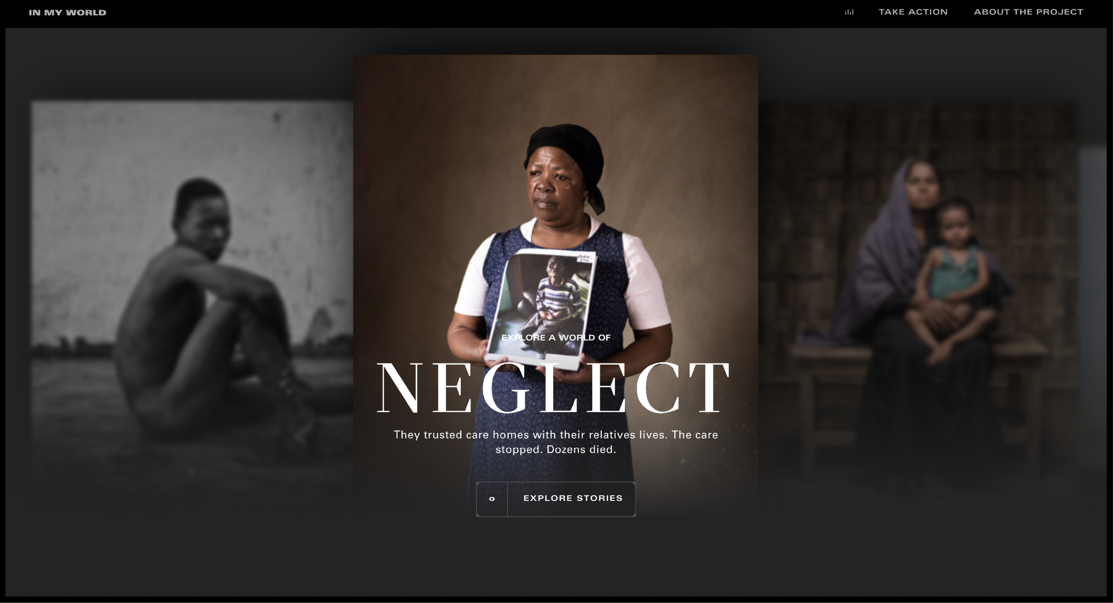
Story-telling is another crucial part of design for social good. In order to drive people to action, you have to be able to thoughtfully and clearly tell the stories behind an organization’s mission and purpose. When treated as such, websites present really incredible opportunities for story-telling through design, and one of our favourite examples of this is the In My World website designed by Danish firm Hello Monday for Witness Change. The In My World campaign gives a voice to some of the world’s most vulnerable people, tackling hard-hitting humanitarian issues and amplifying the Witness Change mission to end human rights violations against marginalized communities.
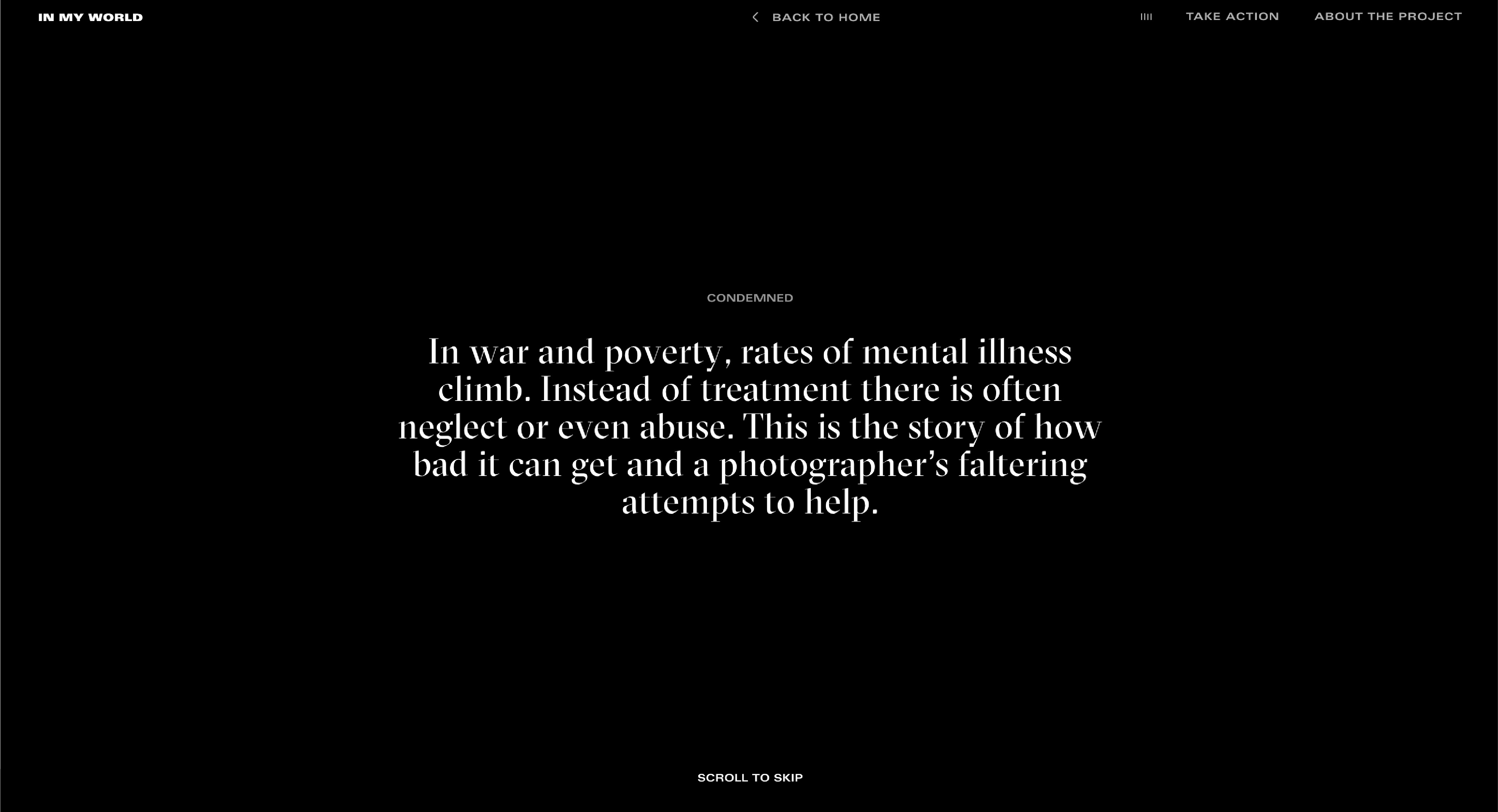
This website strikes a dramatic and sombre tone that is appropriate for and sensitive to the nature of these stories. The design relies heavily on emotional photography, set off by dark backgrounds and white type. The typefaces have a seriousness that complements the imagery – we particularly love the spiky serif font used for large titles and emphasized text. Other graphic elements are minimal – fine lines and minuscule icons – giving the site a stark, utilitarian feel which is fitting for the content.
The real beauty of the story-telling on this site is in the organization & transitions. We love how the story cards are organized and titled on the homepage, as well as the use of both vertical and horizontal “timeline” graphics as you move through sections of each story. The page & section transitions make use of directional movement to give the user a sense of flowing from one place to another. These subtle animations have also been applied to the opening lines of each story, which fade in and out as if they are emerging from and returning into the dark backgrounds. While not as bold and colourful as the rest of our roundup, we feel that this powerful visual storytelling is just as likely to motivate users and readers to take action and join the Witness Change movement.
